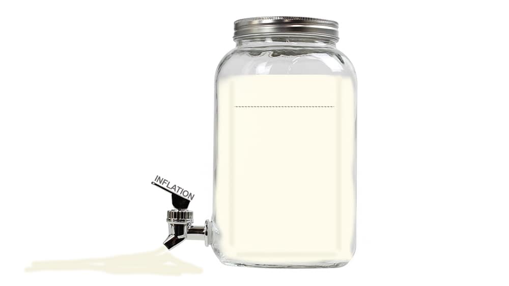
The farm gate milk price is going down for next season although it could still be the eighth highest since 2000. But when it is adjusted for farm inflation the picture changes, as Dan Smith explains.
Recently I was invited into a conversation to share my opinion on the milk price. The conversation was in full swing and centred around the newly forecasted $6.75/kgMS from Fonterra for the 2023/2024 season. The tone of the conversation, while appreciating the tough year ahead for the entire industry, steered dangerously towards making comparisons with previous milk prices. A very human conversation on the surface of it. The milk price is currently x, it was y in the past – let’s see how x compares to y and try to predict the implications of the milk price.
These conversations can be aided with the use of a graph of Fonterra’s payout history. This can easily be created in a style similar to those used in recent articles on this platform:
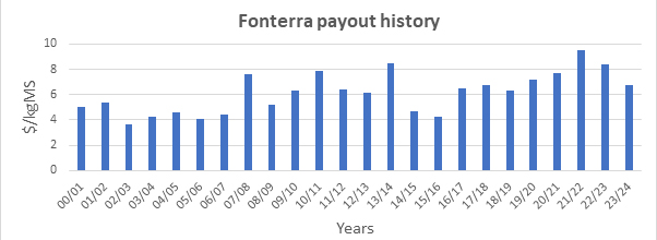
Having this graph would have made a useful visual aid to assist the conversation. Data in this format allows a reader to cast their eye across the different milk prices and compare payouts easily across the century. The current forecast of $6.75/kgMS can be used as a benchmark and then comparisons can be made. The orange line below indicates the $6.75/kgMS payout back to the start of the century. Now comparisons can be made with any historic payout.
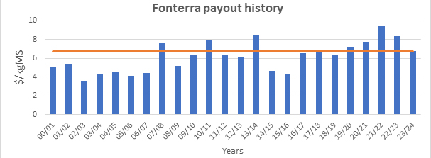
It is quite obvious that the forecast payout this season supersedes the majority of the payouts this century. Of the 23 payouts shown the current is the eighth highest. The conversation could conceivably now continue in the direction it was headed. “The industry has survived lower payouts than this quite regularly this century” “Commentators and industry professionals may be exaggerating the situation this season” “This is because they have been used to riding the high of healthy pay-outs”. Readers know how the rest of the story goes I am sure.
But I specialise in long term agricultural investment analysis. This means I think in terms of real returns. I must always consider discount rates, future values, historic values, and present values. This is why the direction of the discussion mentioned, the graphs shown, and the idea of one casting one’s eye horizontally across those payouts in the graphs above is not an accurate comparison. This is not how one compares values across time. These are nominal values; they are the actual payouts and they are accurate but they are not suitable for comparison. Any comparison of values that occurred at different points in time must first be taken to the same point in time before they are compared.
The concept of discounting values is very complicated and I could probably write a manual on discount rates alone. However, a very simple discount criteria is simply to discount based on inflation.
As an example, if you the reader earn $100 today and also earned $100 on this day last year did you earn the same amount each day? Well, you received the same red note with a gleaming picture of Ernest Rutherford staring back at you (usually nice and crisp due to lack of handling). But, could you have purchased the same amount of ‘stuff’ with it? The answer is no, simply because of inflation. National inflation, according to Statistics New Zealand, in the last year was 6.0%. This means your 2023 $100 can be adjusted by this amount back a year to compare with your 2022 $100. This is a very easy calculation – (2023 income / (1+current inflation)) and the answer is $94.34. So, when comparing what you earned today with what you earned last year you can take your $94.34 back a year and compare it to the $100.
Readers can see where I am going with this, I am sure. What we must do, instead of casting our eye horizontally across the graph above, is cast our eye across a line that is discounted back through time at the rate of inflation. We need to consider the $6.75/kgMS, take one year of inflation off it as in the example above, and then we can reasonably compare it with the $8.40/kgMS of 2022/2023. In which case we could be comparing $6.26 with $8.40.
Avid readers with calculator in hand may have checked the calculation and disagree slightly. This is because this time I didn’t use 6.0%. I used a different inflation rate of 7.80%. This is because we must use rural inflation. The rate of rural inflation is almost always different than national inflation. Typically higher, but there are certainly times when it is lower. Rural inflation data is also available from Statistics New Zealand.
Now for some more easy calculations. One just needs to take the graph above and adjust the orange line back through time by the rate of rural inflation. The graph now appears like so:
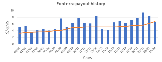
The orange line now represents the 2023/2024 forecast of $6.75/kgMS adjusted back through time at the rate of rural inflation. Now a real comparison can be made between this year’s forecast payout and the historical payouts.
It is obvious now that only twice this century has the payout, in real terms, been lower than the 2023/2024 forecast. This was during the 2014/2015 and 2015/2016 period. It can also be seen that, in real terms, the discounted 2023/2024 milk price dips just below the lowest nominal payout this century. The lowest nominal payout was $3.63/kgMS in 2002/2003 and the current figure discounted through rural inflation arrives at 2002/2003 at $3.54/kgMS.
What this means, what dairy farmers should and can do about it, what this means for the industry, and the wider economy – I will leave to the array of capable professionals and commentators out there. I have a lot of points to offer on what can be done on-farm before, during and after tough times to build businesses resilience which can also be left for another day.
My only two cents at this stage would be please look after your mental wellbeing, particularly any dairy farmers reading this. You are the most important asset your business possesses so please look after that one! Financial stress is a very real pressure that I am sure will be felt across the industry. Please familiarise yourself with the array of tools and help available to assist you through the season.
Dan Smith is an agribusiness lecturer at Lincoln University specialising in investment in the primary sector.
